Hiding Power BI Visuals Based on Slicer Selection
In Power BI, enhancing user experience often involves tailoring visuals to display relevant data. One effective method is to conditionally hide or show visuals based on slicer selections. This approach ensures that users see only pertinent information, streamlining their interaction with the report.
Understanding the Need
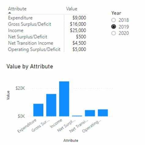
Consider a scenario where a report contains multiple visuals, but only specific visuals are relevant based on user selections. For instance, a visual displaying data for the year 2019 should only be visible when the user selects 2019 from a slicer. Similarly, certain categories might have associated subcategories, and displaying these subcategory visuals only when the main category is selected can prevent clutter and confusion.
Implementing Conditional Visibility
To achieve this dynamic behavior, you can create a measure that evaluates the slicer selection and returns a value indicating whether the visual should be displayed. For example, a DAX measure like:
DAXCopyEditShowHide = IF(MAX([Year]) >= 2019, 0, 1)
This measure checks if the maximum year selected is 2019 or later. If true, it returns 0 (indicating the visual should be shown); otherwise, it returns 1 (indicating the visual should be hidden).
Creating a Transparent Visual
Next, to implement the hiding mechanism, you can use a Treemap visual. Place the ShowHide measure in the 'Values' field well of the Treemap. Then, format the Treemap to make it invisible:
Set the background color to 100% transparency.
Change the field color to white.
Turn off the visual header in the formatting pane.
Position this transparent Treemap over the visual you wish to hide. When the ShowHide measure returns 1, the Treemap will cover the visual, effectively hiding it.
Testing and Final Adjustments
After setting up the measure and transparent visual, test the functionality by selecting different values in the slicer. Ensure that the targeted visual appears or disappears as expected based on the slicer selection. Adjust the positioning of the Treemap if necessary to ensure it correctly overlays the visual.
Considerations
Performance: Be mindful of performance implications when using complex DAX measures, especially with large datasets.
User Experience: Ensure that the hiding mechanism does not confuse users. Consider providing tooltips or labels to indicate that a visual is hidden due to slicer selection.
Alternative Approaches: Depending on the scenario, other methods like using bookmarks or dynamic titles might be more appropriate.
By implementing this technique, you can create more interactive and user-friendly Power BI reports that display only the most relevant information based on user selections.
Hide Power BI


Write a comment ...